


How to capture your readers your readers attention... and then pursuade them to do what you want
There is just no excuse for bad advertising anymore.
Claude Hopkins and the like discovered most of the effective advertising principles used in modern advertising almost 70 years ago.
Strangely enough however, I regularly run across headlines, copy and layouts that break every rule in the book.
Frequently these advertising "sins" happen not through any fault of the advertising agency - but because there client is bull headed - and in spite of zero knowledge, wants their ridiculous ideas brought into fruition.
Currently I'm considering universities that would warrant my sisters application (I'm helping her sift through the many courses.)... And thus... recently went down to my local newsagency and picked up a UNI guide.
As soon as I opened it, on page 2, the first thing I see is an ad that should never have left the lips of the bufoon that thought of it... never lone be put into print.
Here is the offending ad:

Now why, my dear reader, do I dislike this ad so much?
It's for several reasons actually:
Reason #1. Picture is irrelevant to offer.
What does that mean?
Well, scroll back up and take a close look at that ad.
The picture that dominates a good 90% of that advertising space (which isn't cheap) has absoultely no clear benefit to the prospect.
Instead, the advertiser has highlighted a feature of one of its courses in an attempt to interest the prospect... And it's never going to work (tested advertising states: prospects aren't interested in hearing about Bridgstone tires for the cutting edge tread patterns - they are interested in hearing about how the tread patterns are going to save their own lives, and the lives of those they love.)
Reason #2. It's postitioning strategy is out-of-touch with its prospect.
My sister is 17 and currently completing her final exams. She wants to become a medical doctor - and to that end she is studying for hundreds of hours for months at a time.
Now more then ever, students are under more pressure, more stress and have greater expectations placed upon them.
Their teachers constantly hound them with messages of fear and scarcity... Whilst... The cost of attending a university academic insitution seems to go up every year.
That ad considers none of those issues.
Reason #3: There is no benefit stated or implied.
Enough said.
Reason #4: The headline does not contain the name of the university (or make implicit sense).
Hark unto me: you've got less then half a glance to get the readers attention, if the only thing the reader sees is a headline that does not make implicit sense on its own, whilst getting the reader to percieve a benefit tied to the name of whatever you are advertising... the games lost before the first whistle is blown.
Most people are going to scan the ad and then turn the page. The headline should always contain the name of your product because otherwise... well... how will the prospect ever remeber who you are? (remember headlines get five times more readership then body copy, if you don't put the name of your product in the headline, you are thrwoing your advertising dollars away)
Ok, there ARE more problems with that ad... but... I've grown tired of thinking about it.
So let us lighten up a little and move on to one of my favorite ads (an oldy but a goodie)
David Ogilvy (before he passed away in 1999) was the man behind the advertising agency Ogilvy, Benson and Mather.
Apart from being a business scallywag, he also managed to be one of the most brilliant ad copywriters the world has seen.
Personally, I enjoy his layouts because of their ruthless ability to cut through guff - and - deliver the prospect a benefit so clear... it's like... opening a magazine and having a hammer spring out and smack you between the eyes.
And of course, he wrote one ad in particular that no copywiter should not be on intimate terms with...
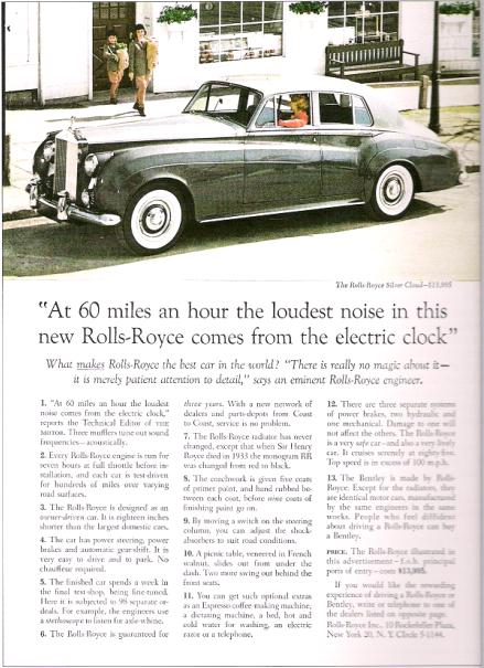
Let us take note of the things that work with this ad.
Reason #1: The picture is relevant to the offer.
Reason #2: The headline contains the name of the product and ties it to a clear benefit.
Reason #3: The body copy is factual (if I remember the story correctly, all Ogilvy did was talk to the cheif mechanic for Rolls Royce and make a list of facts as the mechanic described the performance and mechanics of the car - ironically, after the ad was written, the mechanic saw Ogilvys ad and was reported to respond "we've got to do something about that damn clock!")
Reason #4: There are about 750 words in the body copy. It borders on throwing money away (according to Ogilvy) to pay for a full page and then attempt to sell your product in less then 750 words.
You can see from the two ads if you look at them for more then a couple of seconds, the difference in the ability to capture attention and then pursuade the reader each possesses.
If you are interested in learning more from the great advertising man David Ogilvy, I highly recommend "Ogilvy on Advertising"
John
posted by John Hoff @ 11:49 PM
2 comments
![]()